November 2017 - April 2018
Designing the Heath Newsstand was a flagship project for my tenure at Heath, and one that best exemplifies my strengths as a designer. The decision to build a newsstand in the soon-to-be-vacated space at the entrance to the Heath SF factory and showroom was lightning fast, and with little time to prepare, our skeleton team jumped right into action.
I worked closely with fellow Heathen Sara McBeen, the founding manager/buyer for the Newsstand. Our team was rounded out by Peter Doolittle of PDX Productions, who had previously built the Ferry Building and San Francisco showroom fixtures, and Nik Kinnaird, a good friend who provided drawing and modeling support. The entire process, from concept to design, construction drawings to permit approval, shop drawings to fabrication and install was completed in about 6 months.
Included Projects
Designing the original Heath Newsstand location
Managing the entire permitting and build process
Branding: Logo & Identity
Branding: Collateral & Stationery
Products: T-Shirts and more
No. 1
Designing the Newsstand
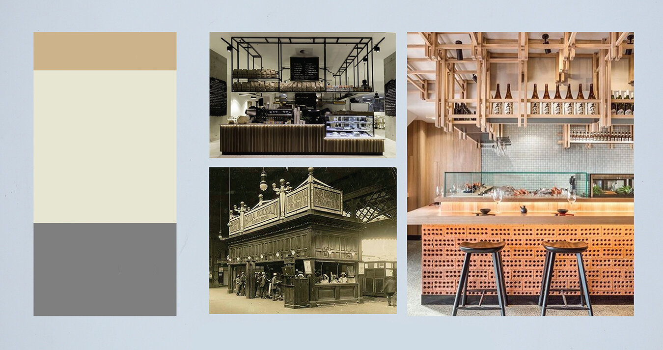
As the principal designer for this project, I worked closely with Heath Creative Director/Owner, Catherine Bailey to move quickly through the design process. I tackled the project by first presenting two different schematic concepts: the “structured framework” and the “floating bookends”. The ultimate design was in many ways a marriage of the two ideas.
Concept 1: Structured Framework
A series of vertical and horizontal components that form a cohesive grid, while maintaining definition between horizontal and vertical components.
Concept 2: Floating Bookends
A sandwich of sorts, with the top block reserved for representing signage and identity, the middle section open for content and highlighting the product, and the bottom block reserved for storage and function.
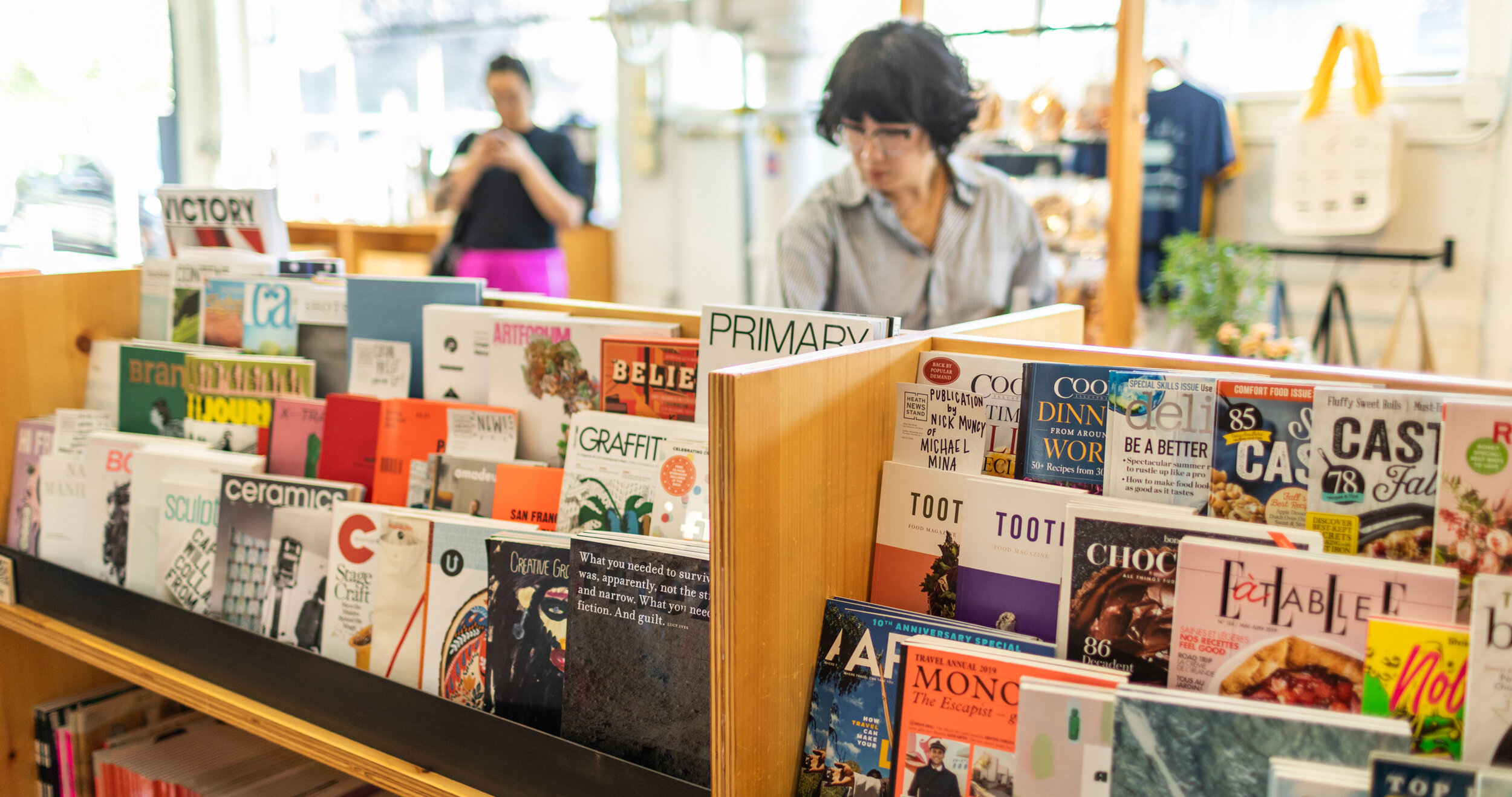
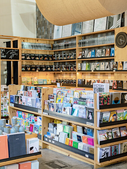
The back side of the Newsstand is transparent to create a 2-way display of magazines, journals, and notebooks. The merchandise advertises itself, while also forming a colorful backdrop to reading benches.
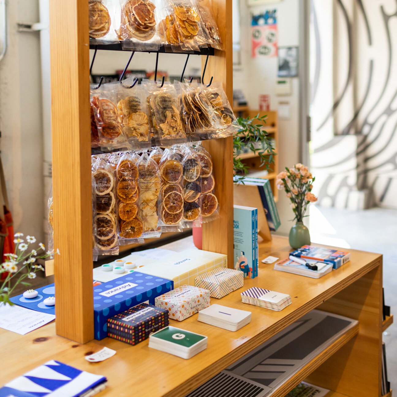
The cashwrap includes a built in glass display case for smaller, specialty items.
Since the merchandising programmatic needs were fairly undefined through the design phase, I worked to design fixtures that could adapt to a slew of different product types.
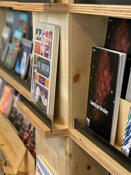
The metal rail design detail serves as a fence for the magazines, a signage backdrop that magnets can easily attach to, and a horizontal contrast to the wood shelving.
The cashwrap, with integrated display shelves and dowels to accommodate every possible type of merchandise, as well as a featured magazine partition behind glass.
The cap of the magazine fixturing is a separate, rolling cart to be used for food and snacks. It is designed to accommodate small food vendors selling pre-packaged meals.
Part of the design includes a rolling flower cart that fits in multiple places in the space, and accommodates the weekly delivery of florals from La Fleuriste (with built in concealed storage in the back).
No. 2
Project Management
Beyond the schematic design, I also acted as the project manager, liaising between contractors and fabricators, Heath’s owners, and other vendors; setting timelines and managing the flow of the project; organizing and adhering to budgets. One of the biggest unknowns going into the project was the question of security—the Newsstand’s footprint sits within a much larger space, that must remain open for extended hours because it serves as the ADA entrance to the factory. Through extensive research, I landed on a security gate that is cleverly stored during the day in a small pocket behind the greeting card display. Working with Heath’s go-to engineer and contractor, we were able to modify the track system to minimize its visual weight in the space, save money, and still have it installed on time.
No. 3
Branding: Logo & Identity
To draw attention to the Newsstand’s existence within the larger (and established) Heath building, I proposed a building-scale mural to announce its arrival, with the artwork then forming the heart of the brand identity. Heath’s long-standing relationship with the exceptionally talented (and friendly) Brendan Monroe was just the ticket. Brendan painted the fantastic mural, and I digitized his artwork for use on building signage, stationery, and more. The logo development was about as straightforward as you could imagine—from the beginning, the obvious choice was this simple outlined “H”, which alludes to both an open magazine and Heath. The type is justified, which allows the shortest word “News” to read most prominently.
No. 4
Branding: Collateral & Stationery
To support the first few months of the Newsstand being in business, I created a suite of stationery materials, including business cards, promo postcards, “New at the Newsstand” bookmarks, blank notecards, stickers, and more. These pieces of collateral and ephemera extend the identity work from the environment into the smallest details of the experience.
No. 5
Products: T-Shirts, Tote Bags, and more
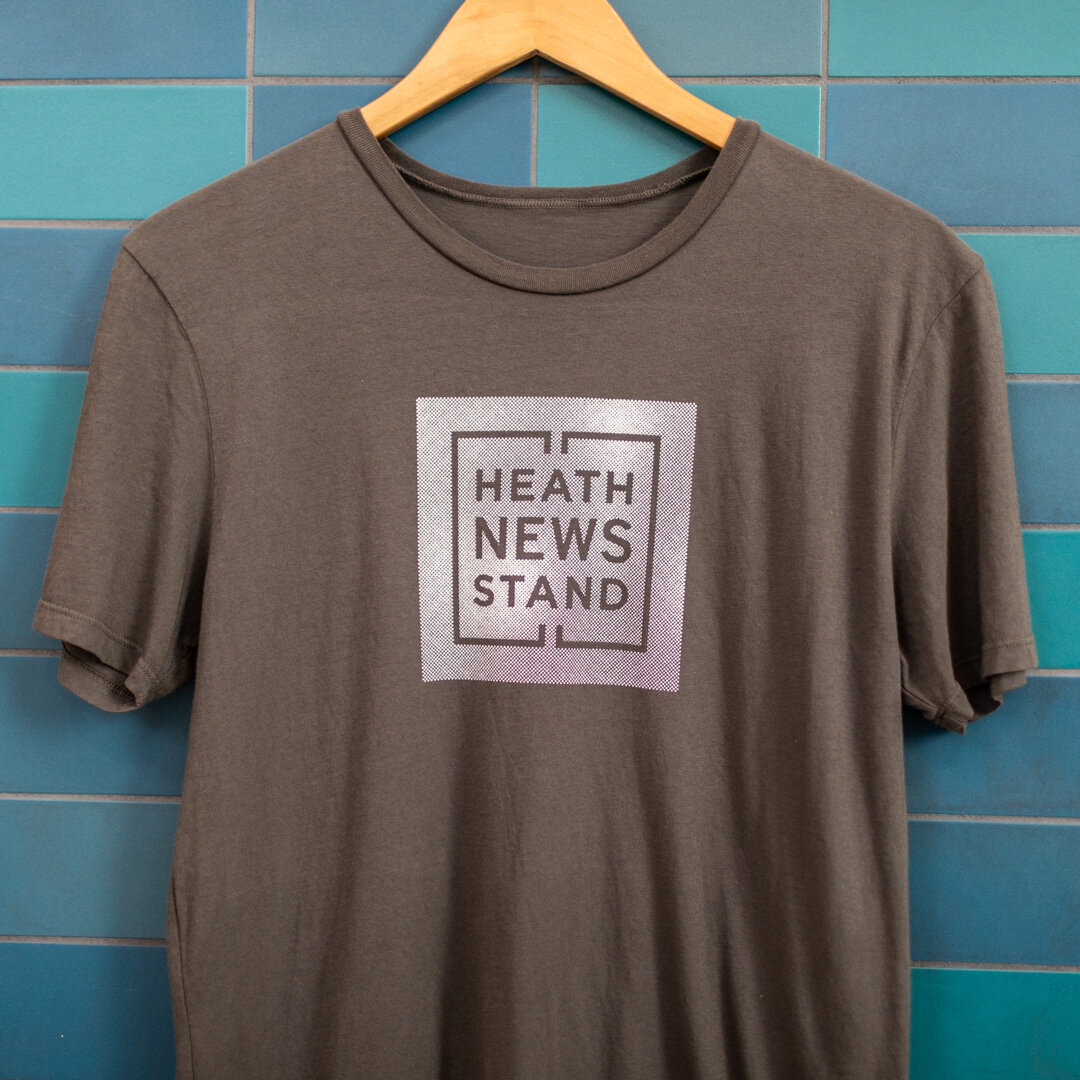
In the interest of bringing the identity to life, we launched the Newsstand with a small assortment of products, including three graphic tees. Over time, we’ve been able to bring in an assortment of other custom products, like lip balms, tote bags, and playing cards.



A pattern I designed originally for a letterpress greeting card, that eventually made its way onto shifts and tote bags, and sold at the Newsstand.

Packaging designed by Lisa Ferkel using the Newsstand's identity principles.

A deck of cards designed by our former intern, Ashley Corcoran, as a side project. We were able to transform her personal project into a beautifully printed and packaged deck of cards, sold at the Newsstand.


